
The one disadvantage about the site that I discovered with this portion of the purchase is that you can't see the cards you're buying, all you get for the vintage is the "book" description of the condition; VG, EX, NM, etc.
Not that these cards were bad, most of them in fact for my purposes were more than acceptable...

The Corrales and Brown cards from the trio of '67s weren't bad at all, but the Barbieri you can plainly see on the left is miscut. The top border is all but gone, and you can see the start of another card on the bottom border. It will count as a placeholder for now until I can upgrade.

I really hadn't bought any 68's in quite a while. These 2 are about par for the course as far as condition goes for my 68 set. I had also forgotten when updating my checklist with these 2 cards that I passed the 200 card mark in hand, meaning I'm a little over 1/3 complete.

The '69 set is another one that doesn't look like much to a lot of collectors, but for me the lack of flash is appealing. What I really like about the '69 set is the backs...
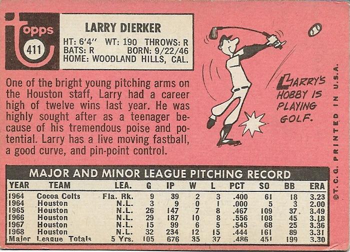
Ever since I bought the '69 Steve Carlton card at the 2012 National, I've been drawn to the pink backs of this set. I can't explain why, the back just appeals to me. The cartoons are great as well, especially this Larry Dierker card showing him hitting a baseball with a golf club. I'm a long way off from putting this set together, and I'm sure chasing the Reggie Jackson RC will be a challenge for me someday down the road. I'm sure by the time that rolls around, I'll be on year 15 of this blog, and still enjoying the thrill of the hunt.
All in all, my first foray into the vintage portion of the Just Commons website wasn't too bad, but without seeing the cards first, I'm not sure how often I'll go that route.
Time will tell...
thanks for reading, Robert
I too have always had a thing for '69 Topps - in my opinion, less is more when it comes to design. I say, let the photo do most of the talking.
ReplyDeleteLooking at that 1968 Gladding makes me think that Topps getting all their photos from Getty maybe isn't such a bad thing.
ReplyDelete